


Favicon Generator: How to Make a Favicon from Text or an Emoji
A favicon is the small square icon that represents your site — the tiny logo you see in a browser tab, next to a bookmark, and beside your site name in Google’s search results. Short for “favourite icon”, it’s usually just 16 × 16 pixels on screen, yet one of the most-seen pieces of branding your blog has. If your site still shows the default WordPress “W” or a plain globe, that little square is quietly making you look unfinished. Our free favicon generator turns one or two letters — or a single emoji — into a full set of files in every size a modern site needs, plus the HTML code to install them, all in your browser. No designer, no paid software.
This guide covers what a favicon does, the sizes and formats that matter (and the ones you can ignore), the design rules for 16-pixel work, and how to add yours to WordPress.
What Is a Favicon, and Where Does It Appear?
You see favicons dozens of times a day without thinking about them:
- Browser tabs, where the icon is often the only thing identifying your page once the tab shrinks.
- Bookmarks and favourites bars, where a recognisable icon makes your site findable at a glance.
- Google search results, where it appears beside your site name on desktop and mobile — a missing or broken one leaves a generic globe in its place.
- Phone home screens, when a reader saves your site as a shortcut; there it behaves like an app icon.
- Browser history, feed readers, link previews and pinned tabs, where it stands in for your logo at small sizes.
That search-results appearance matters most. A favicon doesn’t change where you rank — it’s branding, not an SEO lever, as we’ll cover honestly below — but readers use familiar icons to spot sites they recognise, and a clean one signals a site that’s cared for. A default icon says the opposite.
The Favicon Sizes and Formats That Actually Matter
Ask around and you’ll drown in lists of twenty favicon sizes. In practice, a handful cover everything:
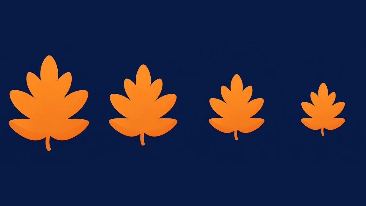
16 × 16 is the classic browser-tab size — the one everyone actually looks at, and the one your design has to survive. 32 × 32 serves retina tabs and Windows taskbar shortcuts. 48 × 48 matters because of Google: its guidelines ask for a square favicon in a multiple of 48 pixels — 48, 96 or 144 — so it scales cleanly for search results, and the file must be crawlable (not blocked in robots.txt). Two bigger sizes cover phones: 180 × 180 is the Apple touch icon for home screens, and 192 × 192 and 512 × 512 are the Android and PWA sizes — 512 also being the file WordPress wants for its Site Icon.
Then there’s format. ICO is the original: a container bundling several sizes into one favicon.ico file. Still valid, but largely a legacy habit — every modern browser accepts PNG favicons declared with link tags, and PNG handles transparency properly. SVG scales beautifully, but support is still patchy, so it works best as an enhancement alongside PNG, not a replacement.
One honest note about our tool: Click Hype’s generator produces the PNG set — 16, 32, 48, 64, 180, 192 and 512 pixels — plus the matching HTML link tags, covering browsers, Google, iPhones and Android in one go. It doesn’t produce an ICO file, because a modern site doesn’t need one. If you specifically want a traditional ICO — for a very old system, say — our icon maker turns any image, emoji or text into a real .ICO file with a PNG pack alongside it.
Will a Favicon Help Your SEO? An Honest Answer
No — not directly, and anyone who tells you otherwise is guessing. A favicon is not a ranking factor, and Google doesn’t promote pages for a pretty tab icon.
What it does affect is how you look once you’re in the results. Google displays the favicon next to your site name, and a missing or default icon makes a listing look neglected beside competitors with tidy branding. There’s also a dull technical point: if Google can’t crawl the file, or it isn’t square, it may not show one at all. So the SEO case is really “don’t look broken” — a hygiene fix, like a working meta description. Worth ten minutes; not worth an agency invoice.
Design Rules for an Icon That’s 16 Pixels Wide
Designing a favicon is an exercise in aggressive simplification: anything detailed — a full logo, a photo, a long word — turns to soup at 16 pixels. The shortcut most well-known sites effectively use is your blog’s initials in a heavy font on your brand colour; it looks deliberate, not homemade. The rules that make it work:
- One idea only. A single bold shape, one or two letters, or one emoji. Use your logo’s simplest element alone rather than shrinking the whole logo.
- One or two colours. Contrast between symbol and background matters more than brand-perfect shades. White on a strong colour is the classic combination for a reason.
- No fine detail, no small text. Thin lines vanish and letterforms crumble. A full name is out; initials — two characters maximum — are the limit.
- Fill the square. A symbol floating in empty padding is invisible in a tab. Let it take up most of the frame.
- Test at actual size. Judge the 16-pixel preview, not the big cheerful one. If you can’t tell what it is at 16px, simplify: bigger letters, heavier weight, fewer elements.
- Decide about the background. A solid rounded square or circle reads well in light and dark themes alike. Transparent suits bold shapes but can make pale artwork vanish on light tabs.
Short of ideas? Borrow structure (not artwork) from sites you admire — most blogs in your niche use initials, a simplified logo mark or a single topic-shaped object. Saving a site’s favicon to study how it survives at 16 pixels is legitimate homework: our favicon grabber downloads the icon from any website in its original file, so you can see how the pros keep things readable. Then build your own — same simplicity, your letters, your colours.
How to Use the Favicon Generator
Open the favicon generator and you’ll find two tabs — one for text, one for emoji. Everything happens on that page, in your browser; nothing you type or create is uploaded anywhere.
- Choose text or emoji. Text mode takes one or two characters — initials work best. Emoji mode takes a single pasted emoji, which brings its own colours.
- Set the weight and size. In text mode, push the font weight towards the bold end and make the letters fill the box.
- Pick colours and shape. Choose text and background colours (or tick transparent background), then square, rounded or circle.
- Check the preview — especially 16px. Alongside a large preview, the tool shows true-size 32px and 16px versions and a mock browser tab. That tiny tab is the verdict: if the letters blur there, go bolder or bigger.
- Download the sizes. Ideally the whole set: 16, 32, 48, 64, the 180 Apple touch icon, and 192 and 512 for Android and WordPress.
- Copy the HTML code. The generator writes link tags for the full set, with file names matching the downloads — keep them for the install step below.
That’s the design done. Now it needs to go on the site.
How to Add Your Favicon to WordPress (and Any Other Site)
The easy WordPress route — Site Icon. Go to Appearance → Customise → Site Identity → Site Icon and upload the 512 × 512 PNG from your set. WordPress automatically generates every smaller size and adds the tags itself. For most blogs, this one upload is genuinely all you need.
The manual route — link tags. If you want your exact files used (or your site isn’t WordPress), upload the PNG set to your site’s root folder and paste the copied HTML into the <head> section. The key lines look like this:
<link rel="icon" type="image/png" sizes="32x32" href="/favicon-32x32.png">
<link rel="apple-touch-icon" sizes="180x180" href="/apple-touch-icon.png">
In WordPress, add them via your theme’s header.php (in a child theme, so an update doesn’t wipe them) or a header-code plugin — not both that and the Site Icon, or you’ll serve duplicate tags. While you’re editing the head, check the other tags living there too: our meta tag generator guide covers titles, descriptions and social tags, which do the heavier lifting for search appearance.
Then clear the cache — and be patient. Favicons are cached more stubbornly than almost anything on the web. Hard-refresh (Ctrl/Cmd + Shift + R); if the old icon lingers, open the favicon file’s URL in a private window to confirm the new one is live. Google updates its copy only on its next homepage crawl, which can take days — normal, not a fault.

Common Favicon Mistakes
- Shrinking the full logo. A detailed logo at 16px is an unreadable smudge. Extract the simplest element — a shape, a letter — and use that.
- Using a whole word or a thin font. Anything beyond two characters, or any light-weight typeface, dissolves at tab size.
- Low contrast. Pale grey on white, or dark navy on black, disappears depending on the reader’s browser theme. Test against both.
- Only uploading one tiny size. A lone 16 × 16 file can’t serve home screens or Google’s 48-multiple requirement, and browsers scale it up badly.
- Blocking the file in robots.txt. If Google can’t crawl the favicon, it can’t show it in results.
Frequently Asked Questions
What size should a favicon be?
You need a set, not a single size: 16 × 16 and 32 × 32 for tabs, a multiple of 48 (such as 48 × 48) for Google’s search display, 180 × 180 for Apple home screens, and 192 × 192 and 512 × 512 for Android.
Do I need an ICO file, or is PNG fine?
PNG is fine for any modern site. ICO was the original format and still works, but every current browser accepts PNG favicons declared with link tags, and PNG handles transparency better. You’d only need ICO for very old systems, or software that specifically asks for one.
Does adding a favicon improve my ranking?
No. A favicon is not a ranking factor, and adding one won’t move your pages up the results. It does appear beside your site name there, so a clean icon helps you look established — a branding benefit, not an SEO one.
Why isn’t my new favicon showing up?
Almost always caching. Browsers hold on to favicons aggressively, so hard-refresh, try a private window, or open the favicon file URL directly to check the new file is live. Google updates its copy only after recrawling your homepage, which can take days.
Can I really use an emoji as a favicon?
Yes — for personal blogs it’s often a smart choice, because an emoji is a bold, colourful, single idea designed to be read at small sizes. Paste it into the generator’s emoji tab, give it a plain or transparent background, and download the same set of sizes.
Final Thoughts
A favicon is the smallest branding job on your blog and, minute for minute, one of the most visible. The recipe is simple: one bold idea, two colours at most, the full set of sizes, and ten minutes with the favicon generator rather than an afternoon in design software.
Set it once, check it at 16 pixels, then forget about it — while it sits in every tab, bookmark and search result making your site look like somebody’s home.